One of the most basic and essential ways to keep the users utilizing your company’s mobile app is to have a valuable and interactive user onboarding. By demonstrating the app functions, behavior, and main traits, you have a high chance of retaining more users after their initial app launch. Thus to show you how other successful companies managed to pull it off, we want to show these six best onboarding examples and reveal what you can learn directly from them.
What is User Onboarding?
User onboarding is the first screen of a mobile application that lets the user get accustomed to all the main features of an app. It sets off the right mood and vibe for a user to continue using your app. Essentially, it is an essential factor that will decide whether your customers will continue using the app or not.
5 Best Onboarding Examples
Netflix
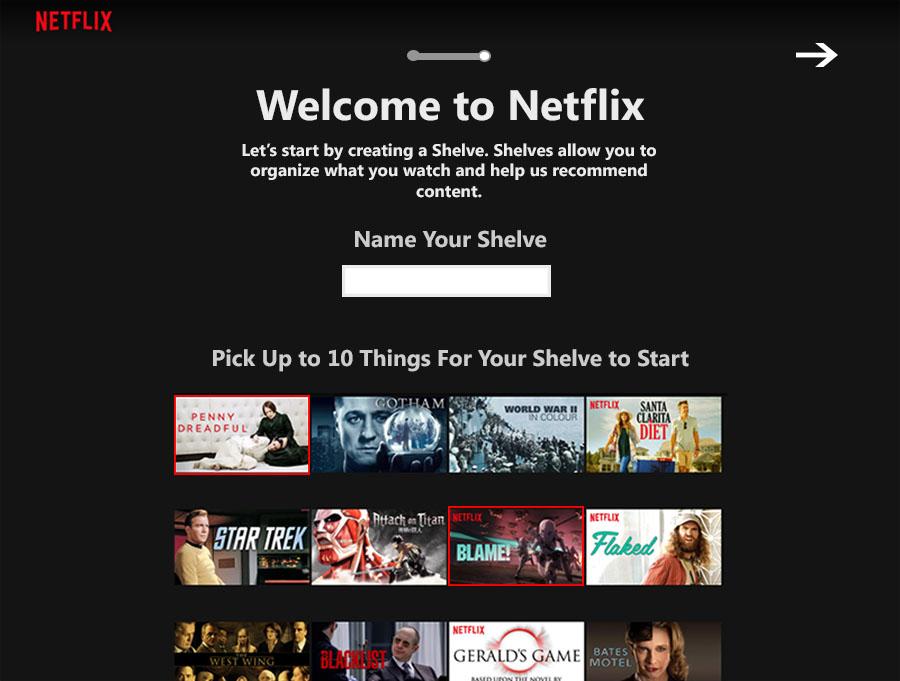
Netflix is one of the iconic and famous examples of a core and solid onboarding process with a wide range of users as it uses a strong personalization point. After the user provided their email address, chose a plan, and entered their payment information, they were asked to rate their interest in various films and TV shows. Netflix then curates a selection of content that its algorithm believes the user will enjoy. The user then navigates the app, exploring and engaging with the content.
Slack
Today, Slack is one of the user-friendliest communication apps made for business. It enables rapid and fast communication between different development teams. Slack’s minimalist user interface contributes to a seamless and entertaining onboarding experience for new users.
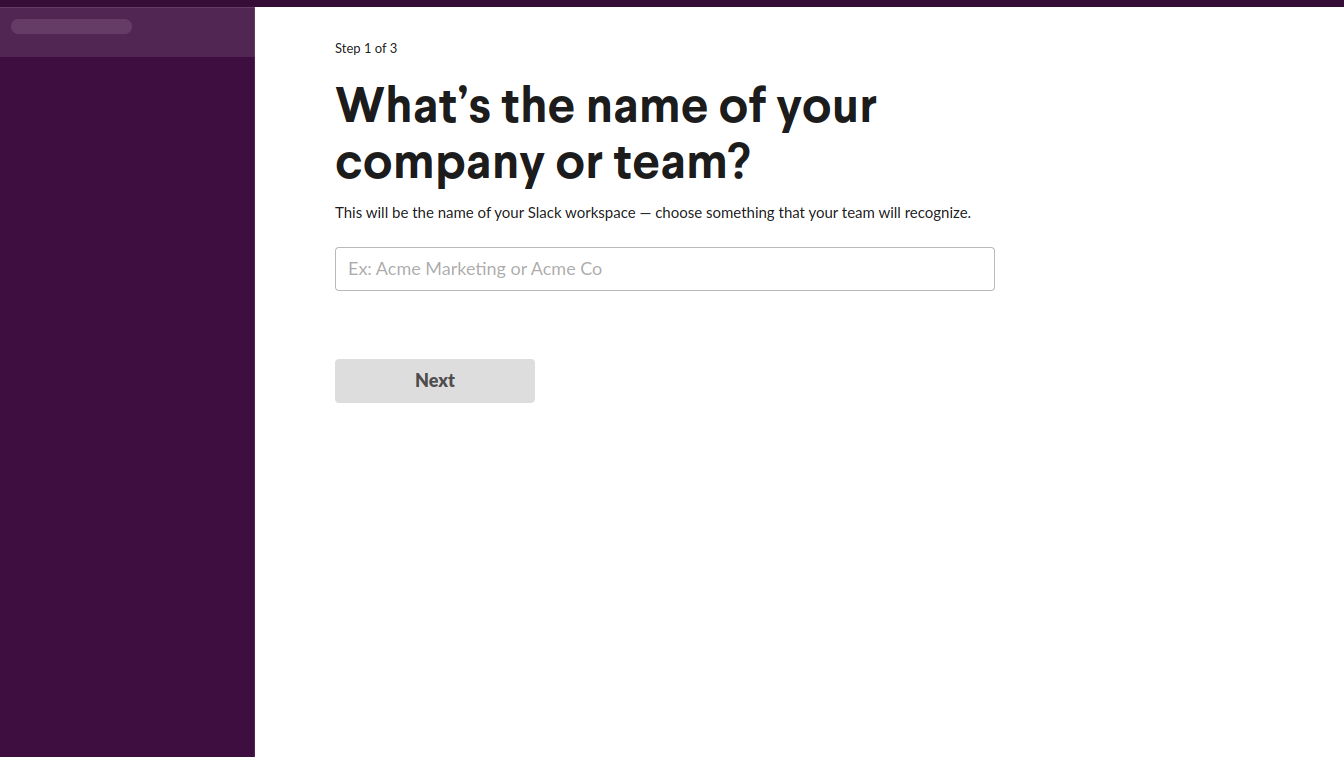
The initial onboarding begins with the three questions: the user’s company, the name of the communication channel, and the email addresses of your team members.
After that, new users are greeted by a chatbot named Slack bot. This bot serves as a guide and gives a little tour around the app, highlighting and assisting with the new Slack features. This contextual and rapid onboarding enables customers to learn how to use and master the product.
Dodo Pizza
Dodo Pizza is a large pizza delivery company based in the Russian Federation. It has a custom mobile app for placing pizza delivery orders, just like the Domino Pizza one. They wanted to boost their mobile application metrics and get higher user engagement.
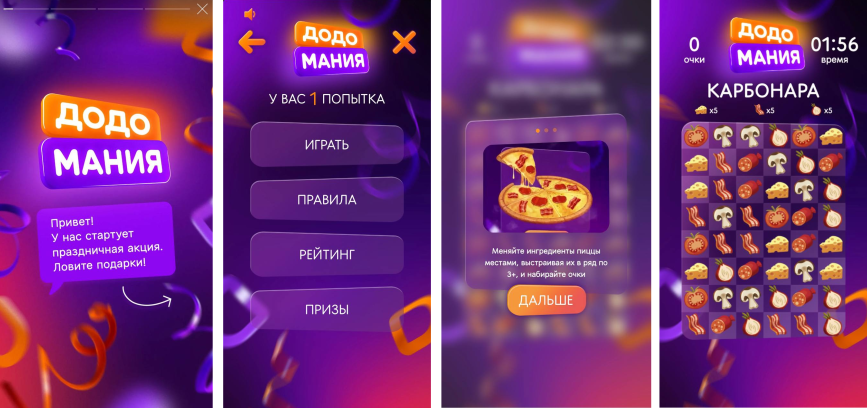
Together with the InAppStory team, they launched several onboarding screens demonstrating recent discount offers and an in-app Story game. After the initial launch, 67% of all people who open onboarding screens would go ahead and either purchase special pizza offers or play the game. Furthermore, 70,000 new users have played the game in just one week, thus interacting with their app much more often. And this is just one of the onboarding examples that InAppStory has implemented.
Calm
Calm is a meditation app created to assist people that have trouble getting a night of good sleep. As soon as the customer opens the app for the first time, the calming music and relaxing design layout are presented throughout the app.
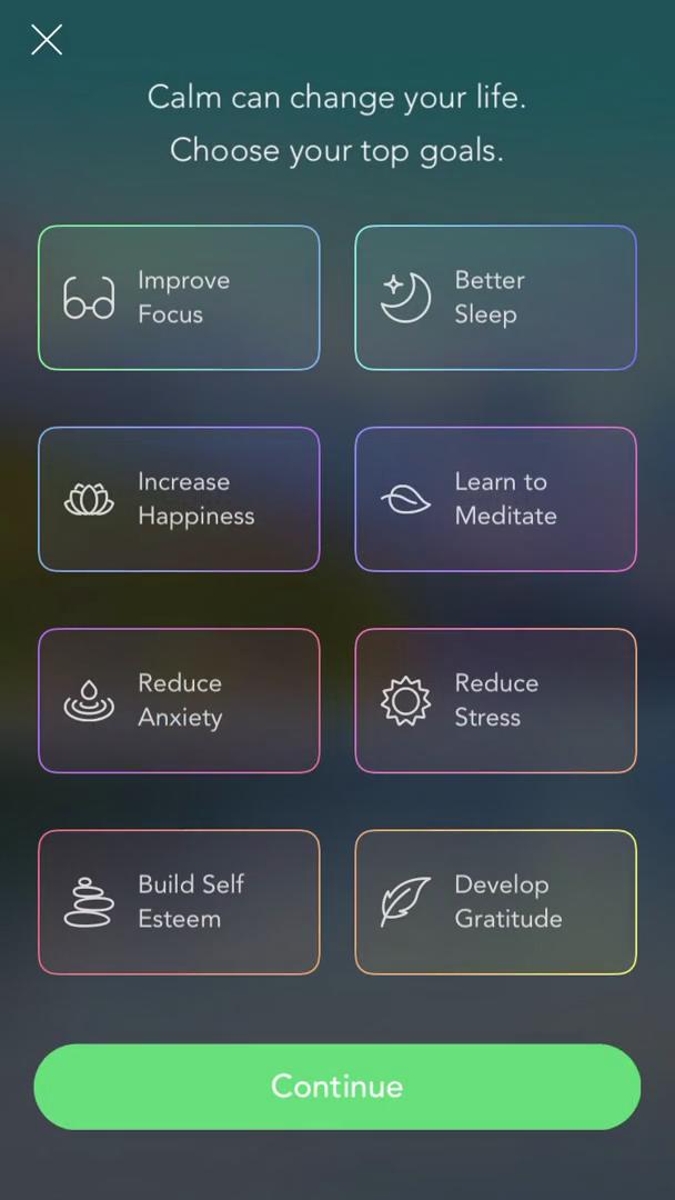
The calming color scheme contributes to the user’s comfort that immediately lets the user feel at ease and at peace. Furthermore, the app will already provide all possible options and needs.
After responding to the initial questions, users are presented with a customized home screen that includes different recommendations for activities that would help them relax.
Tumblr
Even though Tumblr is not as active and engaging a platform as it used to be, it is still worth considering the onboarding example they implemented.
Since the platform was solely based on creativity and individual perception, the onboarding process looks impressive. The very first page you meet (sign up) demonstrates the user-generated content, which already sets the correct expectations from the users right off the bat.
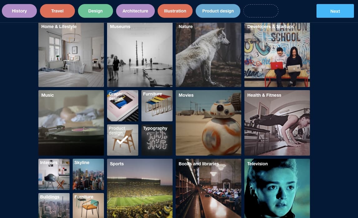
After that, the users will be presented with various digital content that should be chosen according to their preferences. The customers will already see what lies inside the platform with their personalized choice, but they will also feel a sense of ownership of their account.
Basecamp
Basecamp is a platform created for all ambitious companies and teams to implement their unique and creative ideas into reality.
The onboarding feeling into their application is just fantastic. The initial screen will ask users which projects they are currently working on and direct them to the appropriate templates in three easy steps.
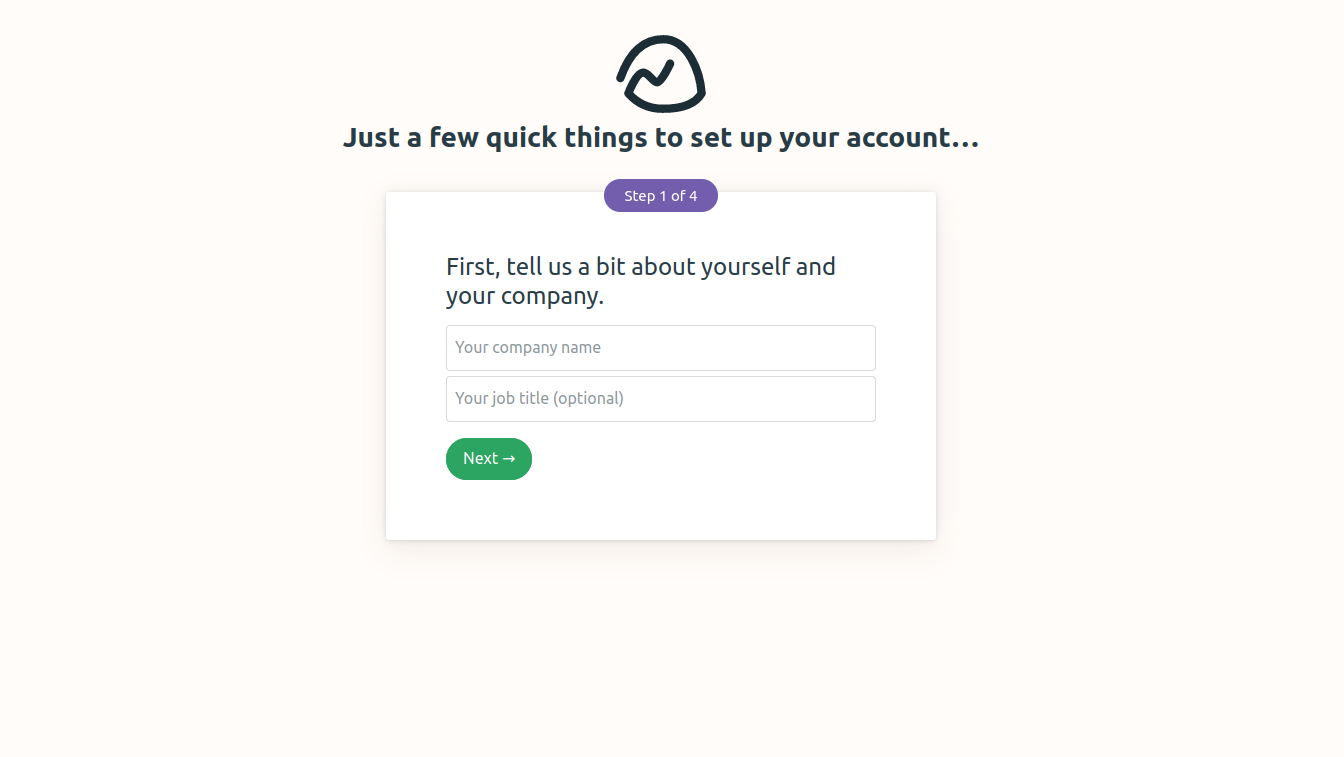
Additionally, Basecamp provides new users with sample projects on their Account page, which they can use as templates to create their projects. Users are urged to post information, add members, and almost inadvertently begin using the tool. The onboarding procedure contributes to retention by requiring users to upload paperwork as soon as possible.
Summary
As you can see from the onboarding examples, each mobile or web app has its unique approach towards user onboarding. However, one particular element significantly differs from the rest of the onboarding screens in the presented list of companies above: mobile app Stories.
Similar to Instagram, the Stories presented in a mobile app from a famous company onboarding screen is capable of significantly boosting your customer engagement at least twice as much as it was before its implementation. Don’t believe it? Try it on your mobile app today at no charge with InAppStory.
Follow Technoroll for more!
Editorial Staff of the TechnoRoll, are a bunch of Tech Writers, who are writing on the trending topics related to technology news and gadgets reviews.

