The design of your website plays a big role in whether users decide to buy or leave.
Research shows that 75% of people form an opinion about a website based on how it looks.
However, even a visually appealing website can still fail if it doesn’t offer a better user experience.

Effective web design goes beyond just making a website look good. This is why it is advisable to hire a professional website design agency.
By applying principles of website design conversion optimization, they can significantly improve your conversion rates.
In this article, we are going to discuss 11 web design best practices for better conversions.
What is the Conversion Rate?

The conversion rate shows the percentage of users who took action compared to the total number of visitors to your site. A higher conversion rate indicates more effective content.
In marketing, conversions happen when a user responds to a call to action, like:
- Making a purchase
- Completing a registration form
- Signing up for a service
Since each conversion brings someone closer to becoming a customer, you want your marketing efforts to generate as many as possible.
What is Conversion Rate Optimization?

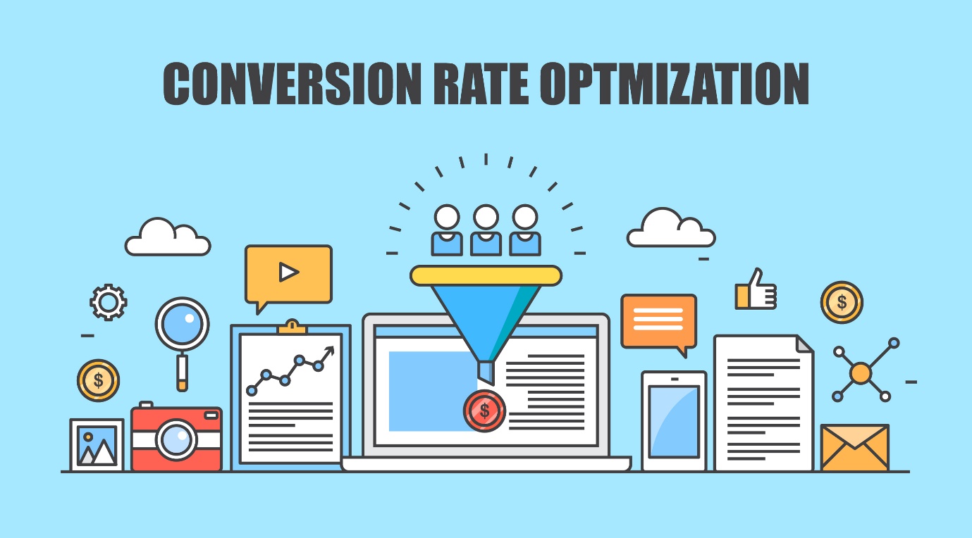
Conversion optimization is about boosting the number of users who take a specific action on a website. It aims to generate more leads.
CRO involves,
- Improving content
- Refining workflows
- Improving web design
- Testing variations
Conversion rate optimization is important because it helps you cut down on the costs of acquiring customers by getting more value from the visitors and users you already attract. By optimizing your conversion rate, you can boost the revenue from each visitor, attract more customers, and expand your business.
For instance, let’s say a landing page has a conversion rate of 10% and gets 1000 visitors a month. That means it generates 100 conversions monthly. If we can improve the conversion rate to 20%, the number of conversions will increase by 50% to 200 per month.
How Does Web Design Affect Conversion Rate?

Every page on your website serves a purpose and should encourage some sort of action. If a page fails to convert, it means something isn’t working, and your website design could be to blame.
Some web design factors that can hurt conversions include,
- Slow loading times
- Complicated forms
- Confusing layouts
- Unpleasant fonts, colors, or overall aesthetics
It all boils down to user experience. If your focus isn’t on providing a smooth and intuitive experience, visitors will likely leave without taking the desired action.
Buyers now have more power than ever before. When they visit your website, they know there are plenty of other options available with just a quick search. They won’t tolerate a poor website experience and won’t bother getting to know your business despite it.
Your website serves as your first impression and a strong design removes obstacles to providing a great experience.
But beyond just creating a positive user experience, the right website design can do more. It not only directs visitors toward the desired action but also motivates them to complete it — in other words, it drives conversion.
11 Web Design Best Practices to Increase Conversion

Follow these 11 web design techniques to boost conversion and increase your revenue:
Responsive design
Given that more than half of web traffic originates from mobile devices, having a responsive design is important. Also, over 40% of online transactions occur on mobile devices. If your website isn’t mobile-friendly, you risk losing sales.
Implementing responsive web design ensures your site adapts to any device, maximizing conversions. With responsive design, users access the same site regardless of their device, whether it’s a tablet, phone, or computer.
Use the rule of thirds
The rule of thirds is a photography principle but you can also use it in digital marketing. It advises dividing images or website space into thirds and positioning main subjects in the left or right thirds. This focuses attention on key elements and call-to-action buttons, without distractions like navigation bars.
For instance, Apple’s website highlights product images on the right grid, while Neil Patel’s site places headers and copy on the far left. Though not necessary for entire websites, applying this principle can emphasize value propositions or product features.
Follow Hick’s Law
Hick’s Law states that the more choices users have, the longer they take to decide. Website clutter from excessive design elements can overwhelm users, leading to decision paralysis. For instance, too many calls to action increase bounce rates or delay desired actions.
You need to simplify choices to improve conversions. Reduce call-to-action buttons and add whitespace around them. This will help you boost conversion rates by up to 232%.
Another tactic is using a full-screen welcome mat on the homepage to present a single call to action. It will minimize distractions while maximizing conversion opportunities.
Optimize your site for speed
Customers can get frustrated easily, especially when browsing a website. Research shows that even a 1-second delay in page loading can lead to a 7% drop in conversions.
Also, Google found that users tend to leave a page if it takes more than 3 seconds to load. It’s essential to regularly check your page speed and fix any issues that might be causing slowdowns. A faster site improves user experience, keeps visitors engaged longer, and boosts conversion rates.
Navigation and user experience
Effective navigation and a good user experience (UX) play a vital role in guiding visitors through the conversion process smoothly. Intuitive navigation helps users find what they need easily, making their experience better and increasing the chances of conversion.
Including elements like easy-to-click buttons, clear menus, and a search option can greatly improve navigation. Likewise, a pleasant UX design, including fast page loading, attractive visuals, and interactive features, can significantly boost engagement and encourage conversions.
Use negative space
Negative space helps you to create balance and clarity in web design. Google effectively uses negative space to maintain a clean and inviting website appearance. Proper use of negative space ensures readability, scannability, and visual comfort for visitors.
Follow these tips to optimize negative space,
- Break up large text blocks into smaller paragraphs
- Adjust letter spacing based on font size
- Maintain an appropriate line height
- Use margins and padding to create white space between elements
These practices enhance website design and user experience, thereby boosting conversion rate.
Use high-quality images of products or services
Attractive visuals not only improve a website’s appearance but also help convey the brand message clearly. High-quality images, infographics, and videos simplify complex information, keeping users interested. Additionally, optimized visuals improve website loading speed.
Also, using lots of images on your website is a fantastic way to showcase your business. People want to see products for themselves before buying, so having clear pictures from different angles is essential. Make sure your images have a simple background, with the product clearly in focus.
Use the right colors
Color choice is crucial in web design. It impacts brand identity, usability, and website ambiance. Different color combinations evoke varied emotions and reactions, influencing visitor perceptions.
Use tools curate color schemes aligning with your brand vision. Make sure there is high contrast between text, headlines, and call-to-action buttons for readability.
For instance, opt for black or navy blue fonts against a white or light yellow background. Highlight important elements, like subscribe buttons, with distinct colors to draw attention.
Apply the 8-second rule
You’ve probably heard this: you only have 8 seconds to grab a visitor’s attention. That’s shorter than a goldfish’s attention span! It means you need to act fast when people arrive on your site.
Here are some simple tips to grab attention and increase conversions in those first 8 seconds:
- Create headlines that clearly communicate the benefits
- Use attractive images to emphasize your main call to action
- Write engaging copy to capture readers’ attention
- Choose big, simple signup buttons
- Add videos or GIFs to explain visually
- Use powerful words to make your copy more interesting
- Use animated popups or sounds to keep visitors engaged
Use strong CTAs
After reading your blog post, users may want to learn more about your business. But if there’s no clear contact info, they might feel lost. That’s where you can use a CTA.
CTAs guide users on the next steps after visiting your site or reading your content. They should be short, straightforward, and easy to understand, prompting users on what to do next.
You can use anchor text or buttons for CTAs, like:
- Buy our product
- Subscribe to our newsletter
- Contact us online
- Get a free quote
Add user testimonials and reviews
Sharing feedback from happy customers boosts your website’s trustworthiness. It reassures potential buyers about the value of your products or services. Adding a review section or featuring selected testimonials on important pages offers real evidence of your claims.
It’s helpful to include a variety of reviews and respond politely to any negative feedback. This shows that you appreciate customer opinions, which can improve conversions.
Do check:
- Microsoft Office 2021 Product Key Free
- Windows 10 Product Keys
- Free Microsoft Visio Professional 2021 Product Key
- Microsoft Office 2003 Product Key
- Extratorrent Proxy 2024
Conclusion
Now that you know the 11 best practices for optimizing website design for better conversions, it’s time to put them into action. Take a close look at your current design and find ways to implement these principles.
By regularly reviewing and adjusting your website’s design, you can greatly increase your conversion rates and move closer to success online.
Follow Technoroll for more!
Editorial Staff of the TechnoRoll, are a bunch of Tech Writers, who are writing on the trending topics related to technology news and gadgets reviews.


