Designing cool email templates is not always about making them feature rich and sophisticated. Good email designs have looks that attract and, at the same time, are practical, simple, and fulfill the purpose of the campaign in the most effective way. Flat email design has its roots in minimalism; it is simplest to the core. It is awesome. Flat designs do not entirely translate to being Skeuomorphic; flat design focuses on brighter colors and unique typography. It is an approach towards making things easier for designers as well as for marketers. Flat designs work in tandem with the purpose of sending the email by helping recipients focus better. With an average 126 emails daily bombarded on an inbox, here’s how you can leverage flat designs as an HTML email developer to stand out. Let’s get started.
5 Distinct Characteristics Of Flat Design Which Will Help You To Enhance Your Email Templates
In this section, we will discuss the five traits of flat designs that will boost your emails’ visual appeal:
#1 Simple Elements
Flat designs use numerous simple user interface elements such as icons and buttons. Here, email developers should pick simple shapes like squares, rectangles, and circles and without cluttering the screen. You can keep shape edges perfectly square and angular or include curvature as well. Each UI element should be easy and simple to click or tap. Interactions should be intuitive for subscribers without a lot of in-design explanation. Remember, flat email design isn’t about using simple elements, it is about simplifying the design for consumption.
#2 Tantalizing Typography
Because of the simple nature of elements in flat design emails, typography is highly important. The tone of typefaces should match the overall design scheme; an extraordinary embellished font might look odd against a super simple design. When pairing fonts, make sure to match the x-height, letter spacing, font style and color to keep your email design sorted. Label buttons and other elements for high ease of interactivity and use.

#3 Minimalist Approach
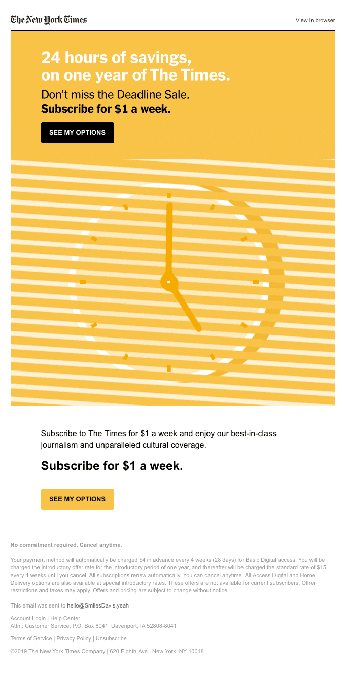
Flat design is simple by nature and works well with a complete minimalist design approach. Avoid using too many elements since this may undermine the flat design. Simple text and color may be enough. Don’t go for vivid rich multimedia options as images are your best bid to flat design. Have a look at the below example of a flat design, minimalist email:

#4 Focus On Color
Color is a big part of flat design. Flat design color palettes lean towards the brighter side of colors and they feel like a modern tribute to old comic designs. Flat design is more about using different tints of the same color than going for a color-rich approach. The tints tend to be vibrant; think about the purest colors from the color wheel, without hues. Primary and secondary colors are famous. Some colors like light blue, orange, and green are used more often as they give a better perspective to flat designs.

#5 Almost Flat Design
A style on which most email developers tend to agree on is ‘Almost’ flat design. Here, the flat design is used as a base while adding qualities of other design trends. Buttons, for instance, may contain slight drop shadows or gradients. Designers typically pick one effect and use it in an almost flat project. The almost flat design approach makes room for including elements of other design languages and the brand language, thus making it more practical and relevant. Email developers like this approach because of added depth and texture. On the other hand, many designers don’t like it because it is the combination of two styles in a way that can lack the definition of a true style. Thus, a large number of email designers go with an almost flat approach instead of sticking to it religiously.
Reasons Why You Should Use Flat Design In Your Email Templates
- With websites embracing flat design language, you can use it to give a more relevant look to your emails.
- Problems like white lines appearing between colors can be kept at bay.
- It is easy to create and loved by email users.
- Flat designs make it easy for designers to personalize, customize, and use different shades of the brand color to create diverse email templates for your brand.
- Use of background images can be minimized by using a color in the backdrop.
Wrap Up
Here, we covered pretty much everything on how flat design in email development could help woo your leads, but I want to add one more thing. Don’t stereotype any element, and try to find how you can originally infuse flat design in your brand language. Implementing flat design shouldn’t leave your subscribers feeling that they’re receiving messages from some dubious third-party trying to impersonate your brand. Instead, flat design needs to blend with your existing email design and strategy at large. With this in mind and the insights shared above, I hope this pocket guide helps you create stellar flat design emails.
Author: Kevin George is Head of Marketing at Email Uplers, one of the fastest growing full service email marketing agency that specializes in crafting professional email templates, PSD to HTML email conversion and free HTML email templates in addition to providing email automation, campaign management, and data integration & migration services. He loves gadgets, bikes, jazz and eats and breathes email marketing. He enjoys sharing his insights and thoughts on email marketing best practices on his blog.
Follow Technoroll for more!
Editorial Staff of the TechnoRoll, are a bunch of Tech Writers, who are writing on the trending topics related to technology news and gadgets reviews.


